2017-07-24
I often solve a Sokoban level and wonder why the author didn’t add another box, stoned another floor, normalized the level… Just gave it a little extra touch to make the level more difficult, more challenging, more beautiful…
People might wonder the same playing my levels…
I often try to make subtle changes to other authors levels. Once in a while i think it is a succes. Mostly I end up with something completely different. And sometimes it ends up as a total disaster.
Let us give it a try.
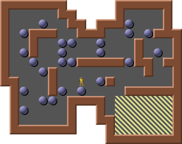
The layout below is a bit boring but is good enough for our purposes. The gameplay is easy. No big challenges. And vast amounts of empty floors crave for additional game elements:
Actually there is room for 4 more boxes outside the goal area. So let us add 4 new boxes and 4 new goals. There is still lots of unneeded floors next to the goal area so 8 floors get stoned. Everything within the original layout. Nothing removed:
The nest for the Sokobird isn’t really needed. And the long passageway into the goal area ads nothing to the gameplay and can be shortened. The goal area goes 3 steps right and one step up:
Original 83 sharpened and compressed. The same gameplay as the original with more boxes and a sharper look.
Sharpened?
The word “Sharpen” describing the discipline of making small changes within the original layout of a level was probably invented by Erim Sever around 2000.
Bigger changes where the original structure still is clearly visible are mostly called “Remodels”
And levels starting by changing an existing level and ending up completely different is just inspired. But neither sharpened or remodeled levels.
My sharpen definition:
1. You can change boxes-on-goal and floors to walls
2. You can add boxes and goals
3. You can normalize the level
A few minor exceptions are accepted if the influence on gameplay is none or minimal:
a. The box layout can be arranged in a more graphically pleasing way
b. If needed the goal area can be enlarged by moving an outer wall
c. You can remove game elements with no purpose
Many levels in Original 51-90 can be sharpened.
Do you know MVP Cargo Bay De Luxe? Big levels. Few boxes.
Do you know MVP Cargo Bay Arranged? Sharpened versions of “De Luxe”.
Still room for lot of improvement:
 MVP Cargo Bay Arranged 60. 9 boxes added
MVP Cargo Bay 60 Sharpened by yours truly. Another 6 boxes added.
The layout of the walls are totally unchanged in the 3 levels (Except the goal area).
And boxes are added while preserving the original layout totally.
The collection Enigma by Brian Kent contains lots of nice designed layouts. Often with very few boxes. Mana for sharpeners.
Enigma 37 before sharpening:
Enigma 37 has been sharpened and remodeled before but I feel my version is the best.
Why?
One thing is to add more game elements inside an existing frame.
Another thing is to stay true to the idea of the level. This level should not just be some more blocks arranged inside the same frame with the longest possible solution. (I could have done that). This level should still be the head of an animal with the boxes forming the eyes when the level is solved:
If you sharpen and publish a level make sure it adds something interesting to the original design. The author should be proud somebody bothers to work with his levels. Not embarrassed.
So don’t stone H7 in the first level and publish it as a “sharper sharpened level”. It is there for the symmetry.
I could be sharper myself:
“Rising Sun” on the left as I published it nearly a year ago. The sharpened version on the right. Surprising for me it was possible to reduce the playing area by more than a row and some.
Is this a better version? For the reduction yes. For the gameplay not necessarily. The level is tighter and it might be easier to spot the losing options.
Don’t forget my favorite sharpened level Original #37 (Actually it was sharp in the beginning and then somebody unsharpened it)
Never hesitate to rethink your sharpened levels. My sharpened Original 83 is a little sloppy. Isn’t it? The solution is not more interesting than the original. And the goal area got an unappealing layout. And even if I left a floor unstoned the goal area still is not perfectly symmetrical.
Back to the drawing board. Remember the original?
Stoning 3 floors upper right and adding only 3 balls. Now you can’t just push forward but have to move back blocks alongside the wall top right before they can go forward. A little more challenging solution. The goal area needs one goal less. Looks nicer with 3 rows:
Twisting the storage area and stoning all possible floors gives the goal area a much more pleasing and perfectly symmetrical layout:
Now it is possible to move the upper left part of the puzzle two steps right. And the ugly fat wall in the top middle becomes only one wall wide. The goal area moves 3 steps right and one step up as before.
Dont forget to normalize the level.
The finished level below. The solution is a little more complicated but not much. The big improvement is a much more harmonic layout.
This one is the keeper. Scrap the rest. Dont publish them.
(Original 83 has to be kept for nostalgic reasons.)


