2017-07-26
Do you like the skin Yoshi by Borgar Torsteinsson?
Would you like the skin in a higher resolution?
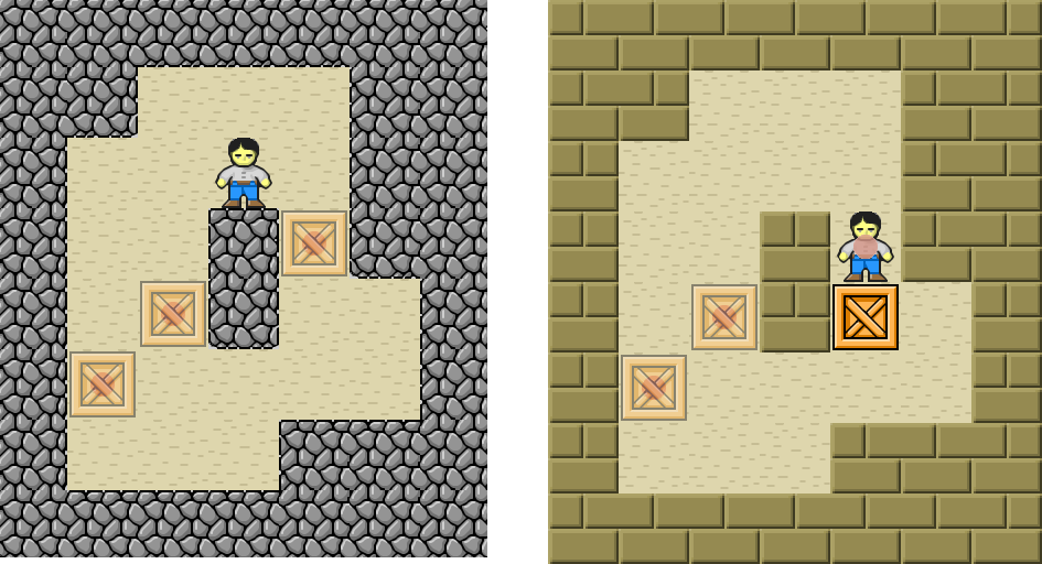
 Find above reworked skins by Brian Damgaard and Tyge Fogh.
Yoshi Classic+ to the left. Yoshi New to the right.
The graphic elements are converted from 32×32 to 64×64 with the program xBRZ.
And a lot of hard work by hand.
Few changes have been made to the graphics. The main changes are a Yoshi not cut flat on the top. And a semitransparent GoalDot used with BoxOnGoal and SokobanOnGoal.
Yoshi Classic+ is very close to the original.
The same applies to Yoshi New. Only the walls are different. Graphics still by Borgar used in the skin “Simple Bricks” but with a new color.
The 32×32 skin for comparison:
 The original Yoshi on the left.
YoshiOnGoal with red pants on the right.
The red pants are an entertaining detail in a Yoshi variant by Ferris made for YSokoban. Ferris also made the animation of the skin. And yes. You have to download the skin to watch it.
The animation are more or less copied to the new skins.
But we decided we didn’t like the red pants.
We didn’t really notice at first but in the end we decided we didn’t like the look of Yoshi’s hair either and changed it a bit.
Who would like to play with the guy with the moustache?

The skins are in the common skin format usable by YASC and YSokoban.
The download contains all four versions presented here. But we think you will prefer the HD versions.
Last revision Yoshi – Common Skins 2017-07-29